
A continuous research model for accessibility
People with disabilities face higher unemployment rates than the general population — yet many job platforms still fall short of meeting their needs. At Indeed, we had audits and conformance checks, but those only told part of the story. We weren’t seeing how people using screen readers, magnifiers, or voice navigation actually experienced our product, and where things broke down.
I co-led a continuous accessibility research program, partnering with our UX Research Lead. We designed a fast, scalable approach to uncover real usability issues, drive fixes, and shift accessibility earlier in the product development process. The result: more inclusive experiences, better tools, and a stronger accessibility culture across the company.
Assistive technologies


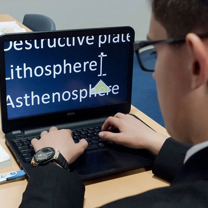
Screen readers
Magnification
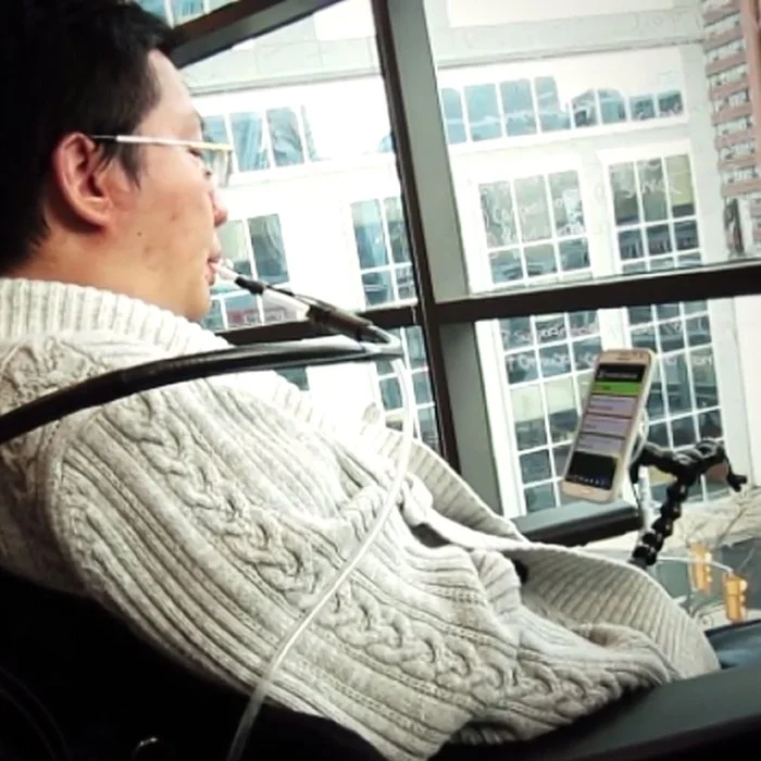
Alternative input devices
Our approach
We audited the live site experience and identified 11 key tasks across the job seeker journey — from searching and filtering to applying and building a resume. We created simple, repeatable research plans with clear timelines and reporting structures. Each product area received:
An Accessibility Usability Score (AUS)
Key usability findings
Video clips of AT users navigating the flow
Actionable recommendations (design, code, or content)
Each round could be completed in just two weeks, enabling us to scale testing across surfaces quickly.
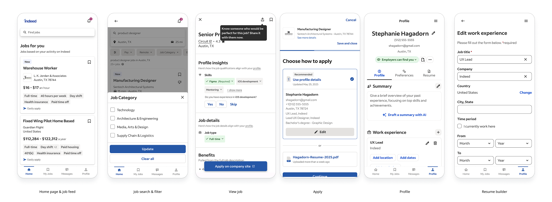
We audited 11 key tasks across employer and job seeker products, mobile and desktop; including Indeed’s most visited pages.
Fixing real problems
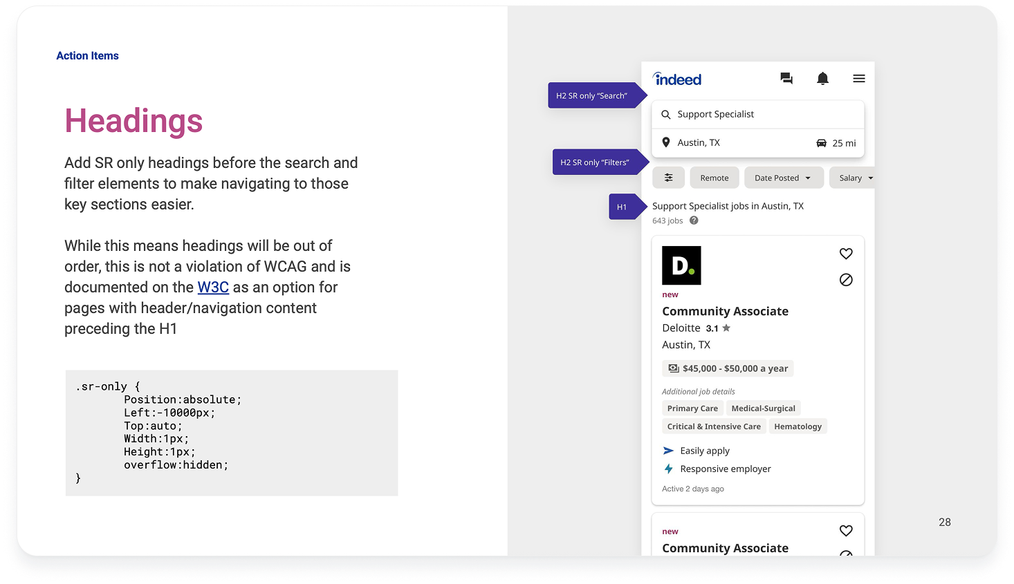
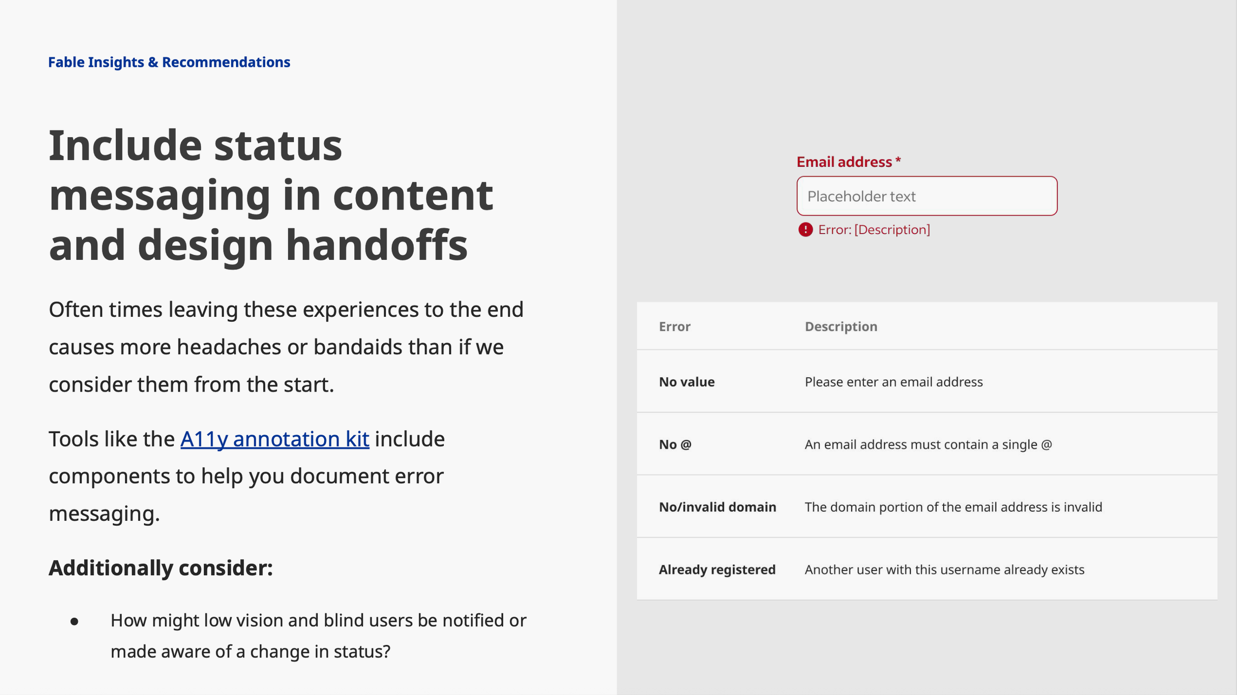
We partnered directly with teams to make fixes and improve usability for AT users. We prioritized issues that created confusion or blockers, like missing or redundant alt text, inconsistent labeling, and unclear or absent feedback
We used AUS scores to benchmark progress and track improvement over time and across surfaces.

Educating and shifting left
To prevent repeat issues, we used video clips and findings to build empathy and drive behavior change. I ran Lunch & Learns, shared examples in our internal channels, and added new guidance to our design system so teams could build more accessibly from the start.
This helped ensure accessibility would be an ongoing practice, not a checklist.


Outcomes
Improved AUS scores across major flows:
Search filters: 85
Apply: 88
Build a resume: 82
(Industry average baseline: ~65)
Identified 70+ critical issues missed by automation and audits
Created accessibility principles to help guide consistent, inclusive design across Indeed